The Bike Lesson was the first book to use the phrase “Berenstain Bears” on the cover.
The Berenstain Bears are recognized today for the famous scripted logo, but it took nearly 20 years before Stan and Jan developed the now-famous cursive branding. In fact, the phrase “Berenstain Bears” wasn’t even used at all in most of the early books.
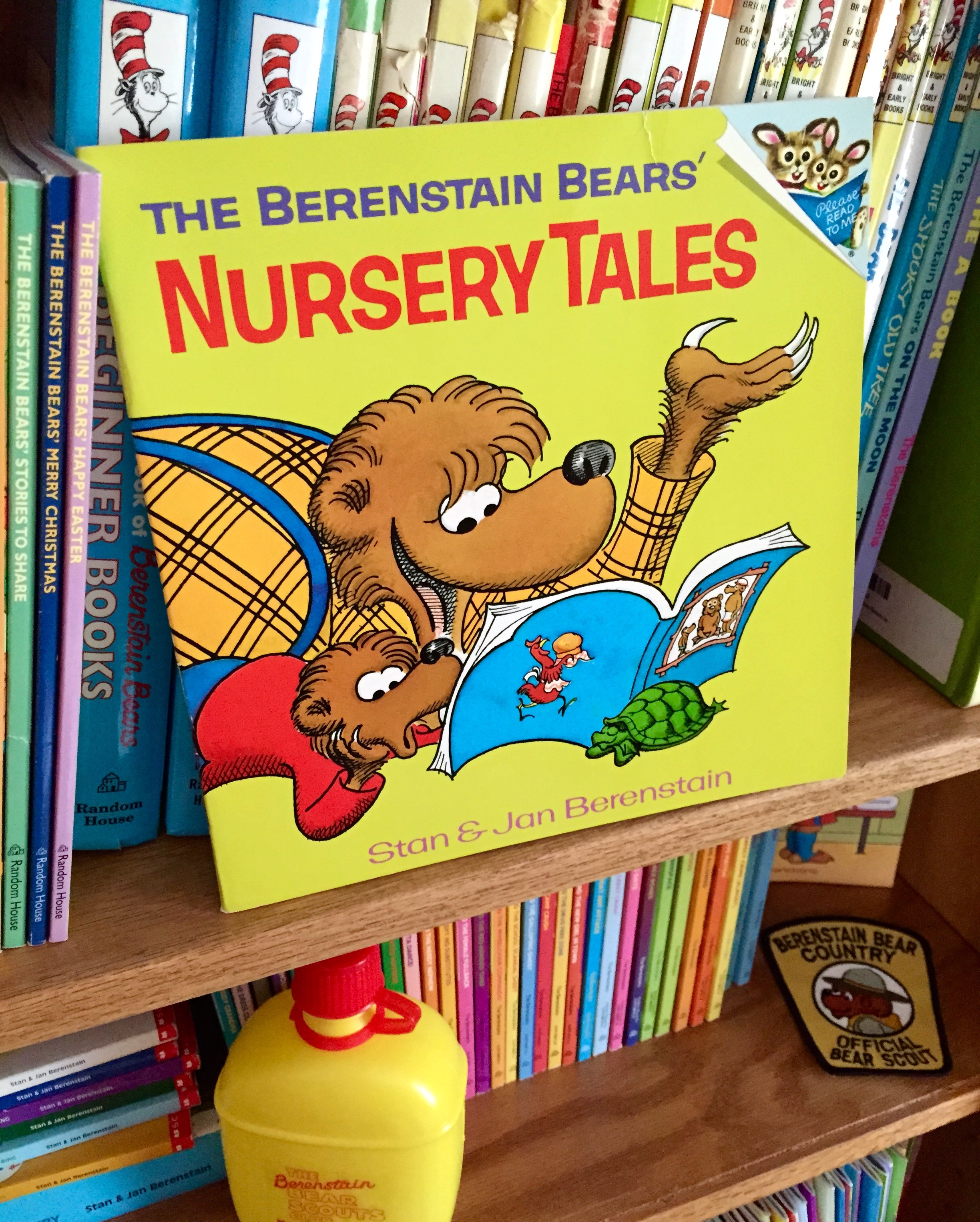
In 1964, Dr. Seuss added a subtitle to “The Bike Lesson,” the 2nd book about Bears that Stan and Jan had written for Seuss’s Beginner Books series. With the phrase “Another adventure of the Berenstain bears,” Seuss had unofficially created a catchy phrase that would eventually become part of every child’s imagination. But it took some time before Stan and Jan Berenstain themselves felt comfortable calling the series of books by this formal name. The first book that officially used the title “The Berenstain Bears…” was “The Berenstain Bears’ Nursery Tales” (1973), a full 11 years after their first bear story, “The Big Honey Hunt.”
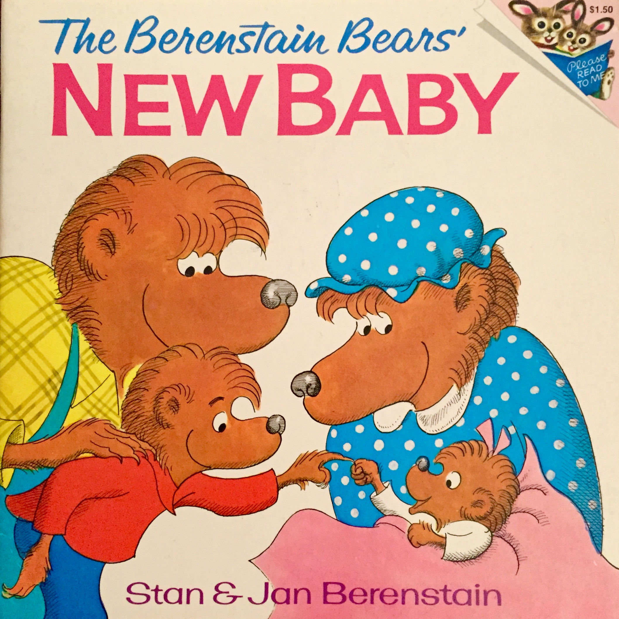
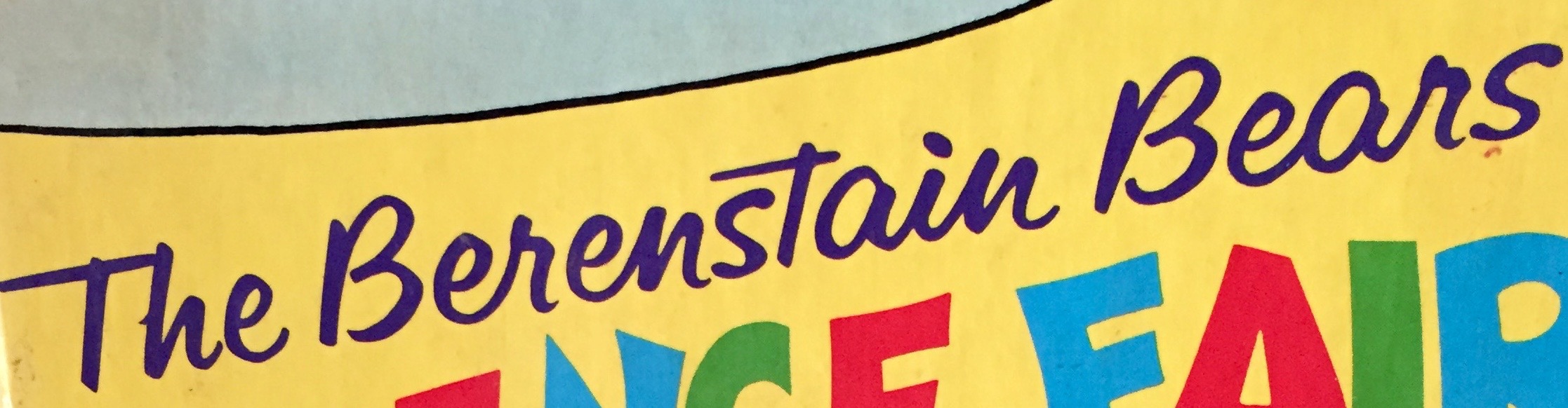
A year after “Nursery Tales,” the Berenstains released their first Berenstain Bears book with the phrase written in a stylized, hand-written font. The book was “The Berenstain Bears New Baby” and the semi-scripted “logo” of sorts would be utilized again in “The Berenstain Bears’ Science Fair” (1977) and “The Berenstain Bears Go to School” (1978). It also served as a clear predecessor to the modern/standard logo we know today.
The first Berenstain Bears book to use a “scripted” logo. It was in use from 1974 to 1978 and is a clear predecessor to the modern standard logo.
TRIVIA: The phrase “THE BERENSTAIN BEARS” was first filed for trademark protection on February 15, 1978.
The first book to use the official title of “The Berenstain Bears…” was “Nursery Tales” from 1973.In the 1970s, the authors had no standard font or style for the phrase “The Berenstain Bears.”
During the 1970s, the authors experimented with several other fonts and styles. Jagged, child-like print was utilized in the Berenstain Bears’ Counting Book (1976), and to a lesser extent in “The Bears Almanac” (1973).
The now-famous Bright and Early Beginner Book, “The Spooky Old Tree,” used a more refined, but still playful “swooping” print.
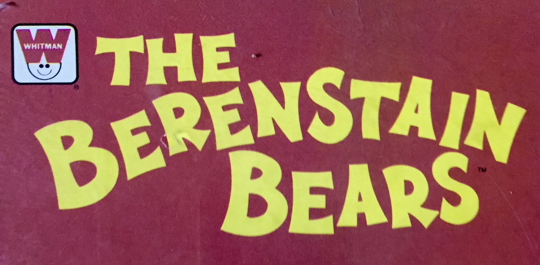
Used from 1978 to 1980, this attempt at a “logo” also did not stick.
It was 1981 when everything changed. On October 12, Random House released four new titles as they launched their new “First Time Books” series. Each of these have become classics and each featured a new, cursive title script for “The Berenstain Bears” section of the title. [Note: two books now commonly understood to be First Time Books were actually first published in the Pictureback Book Series and were late re-assigned to First Time Books. This is why later printings of “The Berenstain Bears’ New Baby” and “The Berenstain Bears Go to School” contain the “First Time Books” logo and/or the Standard scripted title.]
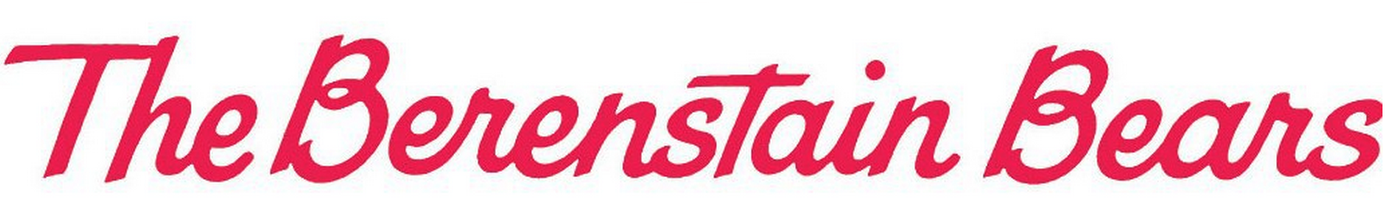
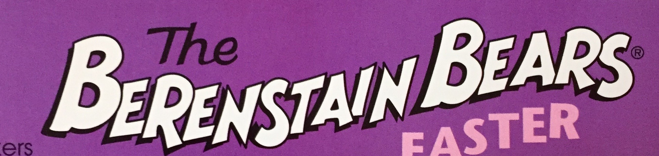
October 12, 1981. The day the world saw the scripted “Berenstain Bears” logo for the first time as Random House launched the First Time Books series. For many years, used only by Random House.Alternate Logo, version 1. 1983-1990.
And while this new logo would continue as the predominant branding of the Berenstain Bears for decades to come, the Berenstains would not use the famous cursive exclusively. It was initially for books published by Random House only. As the Berenstain Bears franchise expanded quickly during the early 1980s, the authors began to produce books and memorabilia with other companies. As a result, during the 1980s and 1990s, several companies — particularly Golden Books — would use an alternate printed logo. This emblem was used on a wide variety of merchandise, especially games and activity books.
Alternate Logo, version 2. 1991-1998. The Berenstain Bears logo used by Golden Books on a wide variety of games and activity books.
After 1998, all Berenstain Bears branding utilized the Standard “Random House” script.
So let’s take a moment and address the elephant in the room…
Why would the Berenstain Bears, a franchise aimed at early readers, choose to utilize a logo that is written in cursive? The “alternate” logo used in the 1980s and 1990s seems the much more logical – and lucrative – branding choice. Was there no publisher’s test group? Were Stan and Jan trying to encourage the teaching of cursive? (Thanks Lorene!) Or was this all a terribly clever way of branding — like kids who can recognize a McDonald’s sign before they can read? Or maybe even an attempt to imitate the famous Walt Disney script? (Thanks Matt!) I wish Stan and Jan had addressed this topic in their autobiography!
Bueller…? Anyone…?
The Berenstain Bears’ Science Fair. Random House, 1977.
Here’s my gut-feel on why the cursive font logo was used: Walt Disney set the precedent for it. Plus, knowing a fair amount about logos (I own a marketing firm and have designed many logos in addition to working with many more), a logo isn’t meant to be read. It becomes visually an image through repetition of use. The best logos can instantly trigger the brand name much more quickly than they can be read and comprehended. Uniqueness is key to this, so that your subconscious picks up on the brand from the logo right away. However, a similarity with other brands in a segment can be beneficial. If a new logo looks somewhat familiar, and the logo it looks like has a positive connotation, then that’s a benefit for the new logo.
This is all conjecture, but the scripted Berenstain Bears logo may have been devised to follow the example set by Walt Disney, or it may be entirely unrelated. Either way, the cursive nature of it helps make it perhaps harder to read as text , but easier to recognize as a complete image; a clear goal of any good logo design.
These are great thoughts Matt! I had considered the cursive logo as a definite choice that stands out…. classic branding that is distinctive. Isn’t it funny that I’ve never thought about the Walt Disney font and that it is also cursive? You’re definitely right…. kids can identify a logo far before then can read (print or cursive) and the Berenstain Bears logo is certainly a great example of how that can be effective!